Identity Lyse Netter
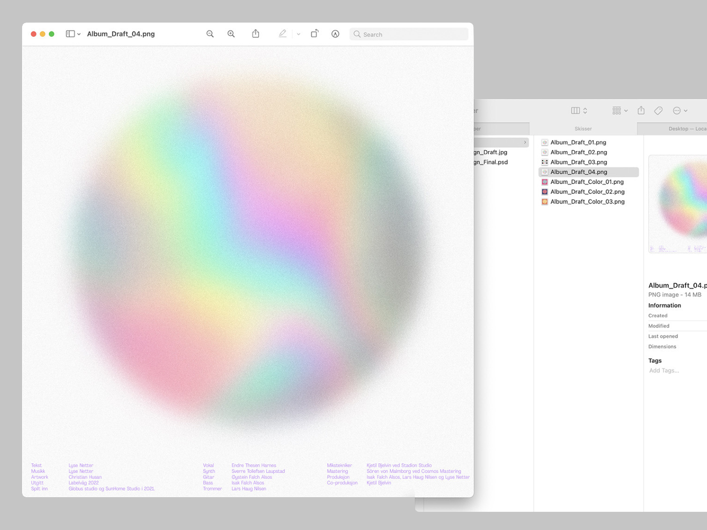
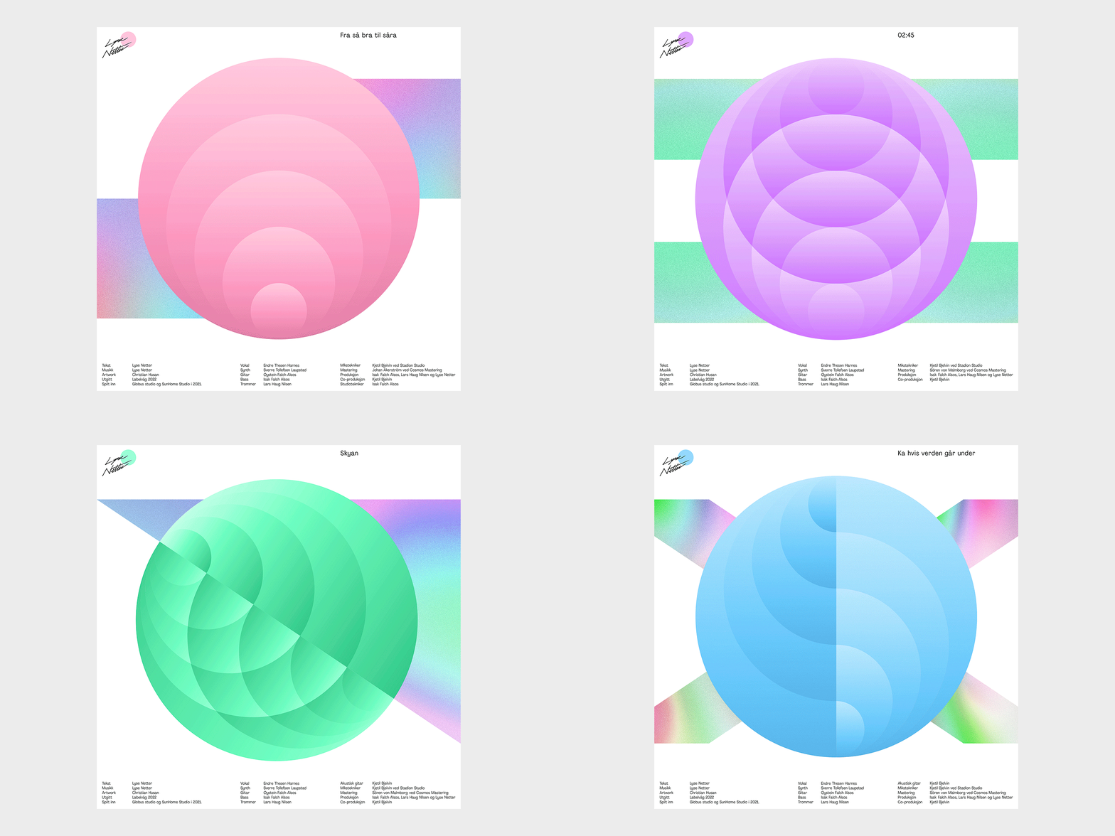
The design process for the pop-group "Lyse Netter" is centered around capturing their roots in Lofoten and incorporating elements of the region's distinctive landscape and culture. The midnight sun, a natural phenomenon characteristic of the region, serves as a foundational inspiration for the design, lending a unique and vibrant color palette to the visuals. Typography is derived from its dramatic peaks, with sharp and angular letterforms that evoke the ruggedness of the landscape. Additionally, an iconographic language system is developed based on International maritime signal flags, referencing the area's maritime heritage.
The design process for the pop-group "Lyse Netter" is centered around capturing their roots in Lofoten and incorporating elements of the region's distinctive landscape and culture. The midnight sun, a natural phenomenon characteristic of the region, serves as a foundational inspiration for the design, lending a unique and vibrant color palette to the visuals. Typography is derived from its dramatic peaks, with sharp and angular letterforms that evoke the ruggedness of the landscape. Additionally, an iconographic language system is developed based on International maritime signal flags, referencing the area's maritime heritage.
Band: Lyse Netter
︎ April 2022
︎ April 2022
︎ Art Direction, Graphic Design, Branding
![]()
![]()
![]()
![]()
![]()


